
Design for a flight booking website

Project summary
For this case study, I started by learning how users book flights today and identified their needs (met and unmet) by their current solutions. Then, I designed and produced a prototype for a new, better way to book flights online and performed usability testing on my prototype.
My role
This project was an exploration into a new way to book flights. I worked alone, without a client. All work was completed entirely by me.
Methods & tools
User interviews, wire framing, information architecture, prototyping, usability testing, Keynote, Sketch, Axure, Google Slides
User
Single traveler in 20s - 30s who is
Interested in affordability
Coordinating with friends
Wants to go someplace interesting
Exploratory interviews
Goal
Understand the mindset of people booking flights
Break down the process (each individual step) people take to book
Identify the key decision-making factors and preferences when choosing flights
Findings
Buyers want peace of mind when they book travel
Flight bookers have preferences when it comes to airline, loyalty programs matter
Flight timing is often flexible
Many travelers are planning trips with friends

Wire framed key screens
Overview
Allow users to set their preferences once so that they could be re-used
Create a buyer guarantee to help with the problem some flight aggregators have
Ability to set up a saved search so that users could monitor their flight options over time
Though my wireframes started as a mobile app, I eventually transitioned this product to a website since most users I spoke to used a laptop when booking flights, not a mobile device.


Information architecture
Key features
Setting user preferences
Searching for flights
Adding friends
Learning about the “guarantee”
Having a unique logged in versus logged out experience
Interactive prototype
Tools
I used Axure to create a clickable, interactive prototype for my flight booking website, Flyt.
Key features
The site allowed users to:
Set up a user profile with preferences
Search for flights with friends
See a feed of their friends’ travel plans
Read about the company’s guarantee
The site also included placeholder pages to read more about the company story, blog, and social media pages.

User profile setup
Sign up lets users set preferences like primary airport, travel programs, and more.

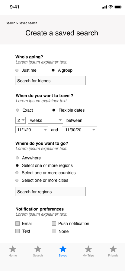
Saved searches
Search for flights with friends by location and time frame, taking into account you and your friends’ preferences. Set alerts for when you want to be notified of updates.

Search results
See a list of flights that fit your search parameters. For each flight, see:
How well each combination matches your and your friends’ preferences
How spread out your arrival times are
The average price of the ticket
Also, easy options to save combo or send combo to friends.

Friend feed
The friend feed allows you communicate with other friends using the app. You can “like” messages with the heart icon or reply to them.
Usability testing
Goals
Understand if this app seems appealing to users (i.e. is it solving a real problem?)
Evaluate the usability of the key task flows:
Sign up
Search for flights

Notes from user testing were categorized into key themes for each part of the prototype.
Findings and Recommendations report
Sign up was jarring. Users wanted to learn more about the service and explore the site before being forced to create an account.
User flows were clear and 100% of users were able to complete both tasks to signing up and completing a search. Some aspects of the sign up process could be improved, especially when it came to documenting travel program perks.
Flight search results page was easy to understand and provided value. Many seemed to feel like the information was pertinent, especially markers like: Flight arrival times and average price.
Search results was missing key information like dates and times of flights. Users liked the high-level view, but wanted to be able to see a more granular view as well.
Friends feed seemed like a useful tool to everyone, especially those who travel with friends a lot. Some wanted more information on how friend interactions would work.


