
Usability review for medical professional association

My proposed redesign of MAMFT’s homepage.
Project summary
The Minnesota Association for Marriage and Family Therapy (MAMFT) is a non-profit organization that serves as the professional home for Marriage and Family Therapists (MFTs) in Minnesota.
With a team of researchers, I evaluated their current website using a set of usability heuristics . In addition, my team conducted 13 in person and remote usability tests, 3 of which I moderated.
This research helped us come up with solutions to help make MAMFT’s website more usable.
My role
Beyond playing a role in our teams research efforts in helping to write our usability script and moderating 3 of the interviews, I also individually provided a set of recommendations and designs for updating their homepage to be more in line with their organization’s mission as well as improving the usability of their event registration process. I then turned these wireframes into a clickable prototype.
Client
Minnesota Association of Marriage and Family Therapy (MAMFT)
Users
Marriage and family therapists as well as couples and families seeking therapy
Methods & Tools
Heuristic analysis, in person usability testing, remote usability testing, Ben Shneiderman’s Eight Golden Rules of Interface Design, Zoom, Fathom Consulting’s Usability Lab, Google Slides, Sketch, Axure
Heuristic analysis
Goal
Uncover any core usability issues to help us focus usability testing.
Method
Ben Shneiderman’s Eight Golden Rules of Interface Design
Findings
I compiled more than 50 usability concerns and compared with my team members’ findings. Top heuristics violated were:
Design dialogue to yield closure
Enable frequent users to use shortcuts
Reduce short-term memory load

Notes from heuristic evaluation and goal identification for usability testing.
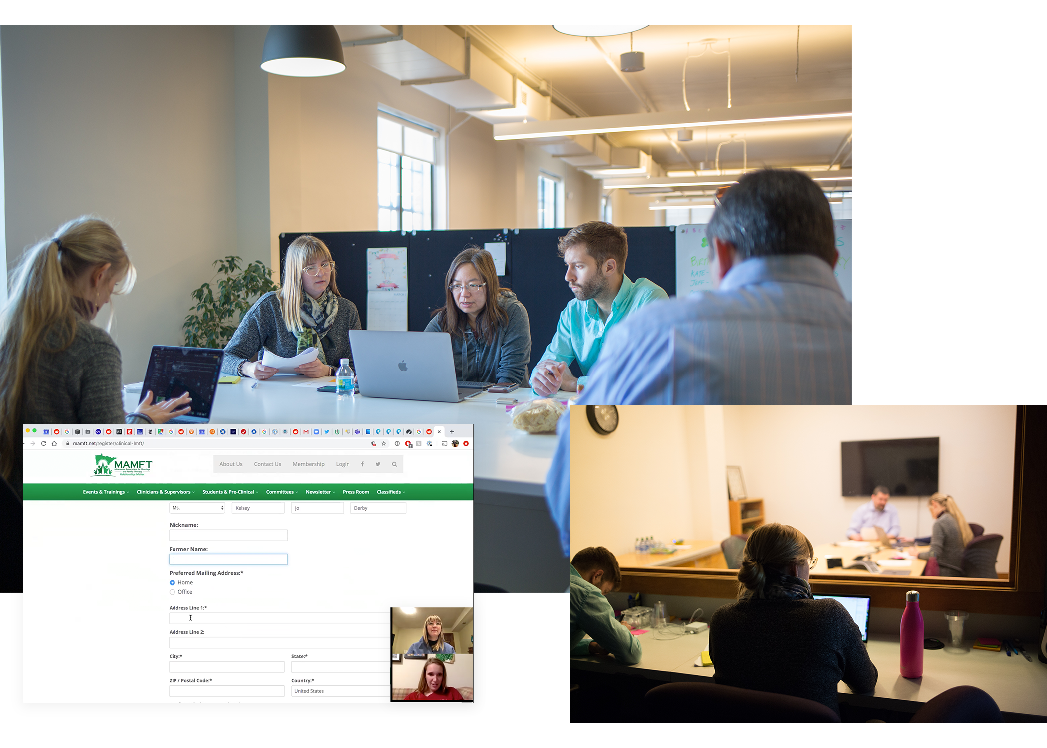
Remote usability test and photos from testing at Fathom Consulting.
Usability testing
Goals
Determine how well this site conveys perceived values of the organization.
Evaluate the perceived and actual usability of primary tasks.
METHOD
Our research team conducted usability testing with 13 participants.
9 remote participants
4 in lab participants
3 participants in therapy (or related field) professionally
11 participants were a member of a professional organization (2 were members of MAMFT)
Synthesize learnings
Process
Feedback from interviews was coded and synthesized to uncover key themes and usability problems.
Key findings
What’s working:
Member sign up was usable
Therapists seem to understand content of site
Opportunities to explore:
More clearly explain MAMFT’s mission
Main tasks (like event registration) should be easy to use and follow established web patterns
Language over all should be simplified, when possible, and use bullets and bolding to highlight key areas

Our team used Trello to code findings by theme, task, user, goal, and more.
Findings and recommendations
Summary
Increase ease of use. Most users were able to complete the primary tasks, but there is room for improvement in creating easier flows.
Simplify & streamline. Create shorter, more scannable copy throughout the site to improve usability and comprehension of organization’s mission.
Clarify audience. Site architecture is geared towards therapists. Make it clear where a patient could go to find an MFT or get resources.
Contents
Summary of usability issues
Annotated wireframes for recommended changes


High-fidelity wireframes
I produced high-fidelity wireframes to show how MAMFT could implement my design recommendations. Explore my prototype or see an overview of each area of focus below.

MAMFT’s homepage
Overview
Clarified the messaging on the homepage so that MAMFT site visitors know what this organization does for the community and who it is for.
Helped reduce confusion over what therapists should view versus people looking for therapy.
Removed auto-rotating carousel that many usability testers complained about.
Goal
Site conveys perceived values of the organization.

Site navigation
Overview
I simplified the site navigation and consolidate navigation into one bar (from three) with clear buckets and drop downs that make sense.
Therapists should have a clear path to events. Non-therapists should be able to easily find resources.
Goal
Important resources are easy to find.

Event index page
Overview
Established hierarchy and patterns on “Events & Trainings” index page to provide clarity on each event:
Location
Date and time (including day of week)
Topic
Course credits
Goal
Increase the usability of event registration.
Event registration flow
Overview
Increased the usability of event registration by having a flow that:
Has easier to read event descriptions
Pre-selects membership ticket for logged in members
Includes a clear progress bar
Automatically populates known information about logged in members
Shows a clear confirmation page
Goal
Increase the usability of event registration.

